## Prerequisites
Before you start using this development framework, make sure you have installed all required software and done all the
necessary configuration [prerequisites](https://github.com/Alfresco/alfresco-ng2-components/blob/master/PREREQUISITES.md).
## Install
Follow the 3 steps below:
1. Npm
```sh
npm install ng2-alfresco-upload --save
```
2. Html
Include these dependencies in your index.html page:
```html
```
3. SystemJs
Add the following components to your systemjs.config.js file:
- ng2-translate
- alfresco-js-api
- ng2-alfresco-core
- ng2-alfresco-upload
Please refer to the following example file: [systemjs.config.js](demo/systemjs.config.js) .
#### Basic usage
```html
```
Example of an App that declares upload button component :
```ts
import { NgModule, Component } from '@angular/core';
import { BrowserModule } from '@angular/platform-browser';
import { platformBrowserDynamic } from '@angular/platform-browser-dynamic';
import { CoreModule, AlfrescoSettingsService, AlfrescoAuthenticationService } from 'ng2-alfresco-core';
import { UploadModule } from 'ng2-alfresco-upload';
@Component({
selector: 'alfresco-app-demo',
template: ``
})
export class MyDemoApp {
constructor(private authService: AlfrescoAuthenticationService, private settingsService: AlfrescoSettingsService) {
settingsService.ecmHost = 'http://localhost:8080';
this.authService.login('admin', 'admin').subscribe(
ticket => {
console.log(ticket);
},
error => {
console.log(error);
});
}
public onSuccess(event: Object): void {
console.log('File uploaded');
}
}
@NgModule({
imports: [
BrowserModule,
CoreModule.forRoot(),
UploadModule.forRoot()
],
declarations: [ MyDemoApp ],
bootstrap: [ MyDemoApp ]
})
export class AppModule { }
platformBrowserDynamic().bootstrapModule(AppModule);
```
#### Events
| Name | Description |
| --- | --- |
| `onSuccess` | The event is emitted when the file is uploaded |
#### Properties
| Name | Type | Default | Description |
| --- | --- | --- | --- |
| `disabled` | *boolean* | false | Toggle component disabled state |
| `showNotificationBar` | *boolean* | true | Hide/show notification bar |
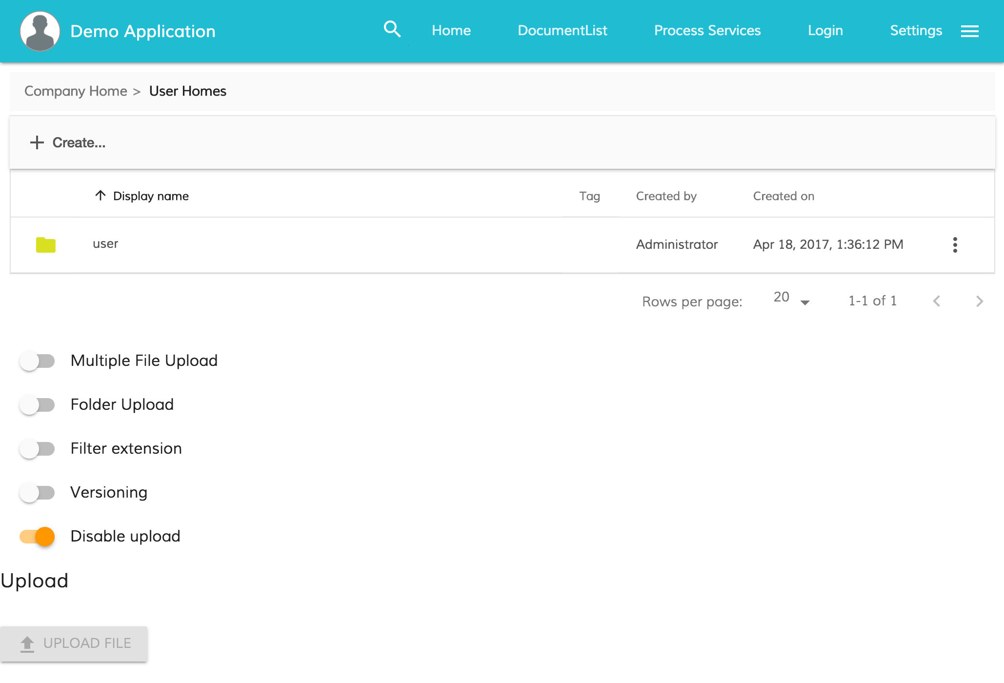
| `uploadFolders` | *boolean* | false | Allow/disallow upload folders (only for chrome) |
| `multipleFiles` | *boolean* | false | Allow/disallow multiple files |
| `acceptedFilesType` | *string* | * | array of allowed file extensions , example: ".jpg,.gif,.png,.svg" |
| `currentFolderPath` | *string* | '/Sites/swsdp/documentLibrary' | define the path where the files are uploaded |
| `versioning` | *boolean* | false | Versioning false is the default uploader behaviour and it rename using an integer suffix if there is a name clash. Versioning true to indicate that a major version should be created |
| `staticTitle` | *string* | 'FILE_UPLOAD.BUTTON.UPLOAD_FILE' or 'FILE_UPLOAD.BUTTON.UPLOAD_FOLDER' string in the JSON text file | define the text of the upload button |
| `disableWithNoPermission` | *boolean* | false | If the value is true and the user doesn't have the permission to delete the node the button will be disabled |
### How to show notification message with no permission
You can show a notification error when the user doesn't have the right permission to perform the action.
The UploadButtonComponent provides the event permissionEvent that is raised when the delete permission is missing
You can subscribe to this event from your component and use the NotificationService to show a message.
```html
export class MyComponent {
onUploadPermissionFailed(event: any) {
this.notificationService.openSnackMessage(`you don't have the ${event.permission} permission to ${event.action} the ${event.type} `, 4000);
}
}
```

#### How to disable the button when the delete permission is missing
You can easily disable the button when the user doesn't own the permission to perform the action.
The UploadButtonComponent provides the property disableWithNoPermission that can be true. In this way the button should be disabled if the delete permission is missing for the node.
```html
```
### Drag and drop
This component, provide a drag and drop are to upload files to alfresco.
#### Basic usage
```html
```
Example of an App that declares upload drag and drop component :
```ts
import { NgModule, Component } from '@angular/core';
import { BrowserModule } from '@angular/platform-browser';
import { platformBrowserDynamic } from '@angular/platform-browser-dynamic';
import { CoreModule, AlfrescoSettingsService, AlfrescoAuthenticationService } from 'ng2-alfresco-core';
import { UploadModule } from 'ng2-alfresco-upload';
@Component({
selector: 'alfresco-app-demo',
template: `
DRAG HERE
`
})
export class MyDemoApp {
constructor(private authService: AlfrescoAuthenticationService, private settingsService: AlfrescoSettingsService) {
settingsService.ecmHost = 'http://localhost:8080';
this.authService.login('admin', 'admin').subscribe(
ticket => {
console.log(ticket);
},
error => {
console.log(error);
});
}
public onSuccess(event: Object): void {
console.log('File uploaded');
}
}
@NgModule({
imports: [
BrowserModule,
CoreModule.forRoot(),
UploadModule.forRoot()
],
declarations: [ MyDemoApp ],
bootstrap: [ MyDemoApp ]
})
export class AppModule { }
platformBrowserDynamic().bootstrapModule(AppModule);
```
#### Events
| Name | Description |
| --- | --- |
| `onSuccess` | The event is emitted when the file is uploaded |
#### Propertoes
| Name | Type | Default | Description |
| --- | --- | --- | --- |
| `showNotificationBar` | *boolean* | true | Hide/show notification bar |
| `currentFolderPath` | *string* | '/Sites/swsdp/documentLibrary' | define the path where the files are uploaded |
| `versioning` | *boolean* | false | Versioning false is the default uploader behaviour and it rename using an integer suffix if there is a name clash. Versioning true to indicate that a major version should be created |
### Files Dialog
This component provides a dialog that shows all the files uploaded with upload button or drag & drop area components.
This component should be used in combination with upload button or drag & drop area.
#### Basic usage
```html
```
## Build from sources
Alternatively you can build component from sources with the following commands:
```sh
npm install
npm run build
```
### Build the files and keep watching for changes
```sh
$ npm run build:w
```
## Running unit tests
```sh
npm test
```
### Running unit tests in browser
```sh
npm test-browser
```
This task rebuilds all the code, runs tslint, license checks and other quality check tools
before performing unit testing.
### Code coverage
```sh
npm run coverage
```
## Demo
If you want have a demo of how the component works, please check the demo folder :
```sh
cd demo
npm install
npm start
```
## NPM scripts
| Command | Description |
| --- | --- |
| npm run build | Build component |
| npm run test | Run unit tests in the console |
| npm run test-browser | Run unit tests in the browser
| npm run coverage | Run unit tests and display code coverage report |
## License
[Apache Version 2.0](https://github.com/Alfresco/alfresco-ng2-components/blob/master/LICENSE)


