 31479cfaa4
* [ADF-4152] Moved proc services cloud docs to subfolders

* [ADF-4152] Fixed links in PS cloud docs

* [ADF-4152] Added subfolders and checked links for extensions and insights docs

* [ADF-4152] Moved proc services cloud docs to subfolders

* [ADF-4152] Fixed links in PS cloud docs

* [ADF-4152] Added subfolders and checked links for extensions and insights docs

* [ADF-4152] Fixed links in Proc cloud, Insights and Extensions docs

* [ADF-4152] Updated links in user guide

* [ADF-4152] Fixed broken links in tutorials

* [ADF-4152] Fixed remaining links in core docs

* [ADF-4152] Fixed remaining links in proc services docs

* [ADF-4152] Fixed remaining links in content services docs

* [ADF-4152] Fixed links in breaking changes docs

* [ADF-4152] Updated main README index page

* [ADF-4152] Fixed glitches with preview ext component docs
9.3 KiB
Title, Added, Status, Last reviewed
| Title | Added | Status | Last reviewed |
|---|---|---|---|
| Data Column Component | v2.0.0 | Active | 2018-11-12 |
Data Column Component
Defines column properties for DataTable, Tasklist, Document List and other components.
Contents
Basic Usage
<adf-datatable [data]="data">
    <data-columns>
        <data-column key="icon" type="image" [sortable]="false"></data-column>
        <data-column key="id" title="Id"></data-column>
        <data-column key="createdOn" title="Created"></data-column>
        <data-column key="name" title="Name" class="full-width name-column"></data-column>
        <data-column key="createdBy.name" title="Created By"></data-column>
    </data-columns>
</adf-datatable>
Class members
Properties
| Name | Type | Default value | Description |
|---|---|---|---|
| cssClass | string |
Additional CSS class to be applied to column (header and cells). | |
| format | string |
Value format (if supported by the parent component), for example format of the date. | |
| formatTooltip | Function |
Custom tooltip formatter function. | |
| key | string |
Data source key. Can be either a column/property key like title or a property path like createdBy.name. |
|
| sortable | boolean |
true | Toggles ability to sort by this column, for example by clicking the column header. |
| srTitle | string |
Title to be used for screen readers. | |
| title | string |
"" | Display title of the column, typically used for column headers. You can use the i18n resource key to get it translated automatically. |
| type | string |
"text" | Value type for the column. Possible settings are 'text', 'image', 'date', 'fileSize' and 'location'. |
Details
Conditional visibility
You can use ngIf directives to provide conditional visibility support for the columns:
<data-column
    *nfIg="showNameColumn"
    key="name"
    title="MY.RESOURCE.KEY">
</data-column>
Automatic column header translation
You can use i18n resource keys with the
DataColumn title property.
The component will automatically check the appropriate i18n resources and fetch the corresponding value.
<data-column
    key="name"
    title="MY.RESOURCE.KEY">
</data-column>
This feature is optional. Regular text (either plain or converted via the translate pipe) will still work as normal.
Custom tooltips
You can create custom tooltips for the table cells by providing a formatTooltip property with a tooltip formatter function when declaring a data column.
<data-column
    title="Name"
    key="name"
    [formatTooltip]="getNodeNameTooltip"
    class="full-width ellipsis-cell">
</data-column>
And the code in this case will be similar to the following:
import { DataColumn, DataRow } from '@alfresco/adf-core';

@Component({...})
export class MyComponent {
    ...

    getNodeNameTooltip(row: DataRow, col: DataColumn): string {
        if (row) {
            return row.getValue('name');
        }
        return null;
    }
}
To disable the tooltip your function can return null or an empty string.
Column Template
You can provide custom column/cell templates that may contain other Angular components or HTML elements:
Every cell in the DataTable component is bound to the dynamic data context containing the following properties:
| Name | Type | Description |
|---|---|---|
| data | DataTableAdapter |
Data adapter instance. |
| row | DataRow |
Current data row instance. |
| col | DataColumn |
Current data column instance. |
You can use all three properties to gain full access to underlying data from within your custom templates.
In order to wire HTML templates with the data context you will need to define a variable that is bound to $implicit as shown below:
<ng-template let-context="$implicit">
    <!-- template body -->
</ng-template>
The name format is let-VARIABLE_NAME="$implicit" where VARIABLE_NAME is the name of the variable you want to bind the template data context to.
You can also get a cell value from the underlying DataTableAdapter:
context.data.getValue(entry.row, entry.col);
You can retrieve all property values for the underlying node, including nested properties (via property paths):
context.row.getValue('name')
context.row.getValue('createdByUser.displayName')
You may want to use the row API to get access to the raw values.
<data-column title="Name" key="name" sortable="true" class="full-width ellipsis-cell">
    <ng-template let-context="$implicit">
        <span>Hi! {{context.row.getValue('createdByUser.displayName')}}</span>
        <span>Hi! {{context.row.getValue('name')}}</span>
    </ng-template>
</data-column>
Use the data API to get values with post-processing (eg, datetime or icon conversion).
In the Example below we will prepend Hi! to each file and folder name in the list:
<data-column title="Name" key="name" sortable="true" class="full-width ellipsis-cell">
    <ng-template let-entry="$implicit">
        <span>Hi! {{entry.data.getValue(entry.row, entry.col)}}</span>
    </ng-template>
</data-column>
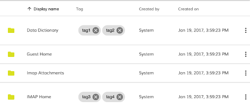
In the Example below we will integrate the adf-tag-node-list component within the document list.
<data-column
    title="{{'DOCUMENT_LIST.COLUMNS.TAG' | translate}}"
    key="id"
    sortable="true"
    class="full-width ellipsis-cell">
    <ng-template let-entry="$implicit">
        <adf-tag-node-list  [nodeId]="entry.data.getValue(entry.row, entry.col)"></adf-tag-node-list>
    </ng-template>
</data-column>
Styling Techniques
You can add a custom CSS class to a column using its class property. This is useful for
many purposes - some examples are given below.
Custom icons for selected rows
Custom styling can be used to change the look and feel of the icon for the selected rows.
Let's start by assigning an "image-table-cell" class to the thumbnail column:
<adf-document-list ...>
    <data-columns>

        <data-column
            key="$thumbnail"
            type="image"
            [sortable]="false"
            class="adf-image-table-cell">
        </data-column>

        ...
    </data-columns>
</adf-document-list>
Now your application can define styles to change the content of the column based on conditions such as the selection state:
adf-document-list ::ng-deep adf-datatable > table > tbody > tr.is-selected > td.adf-datatable-cell.adf-datatable-cell--image.adf-image-table-cell > div > div > mat-icon > svg {
    fill: #00bcd4;
}
Once your application starts you should see the following icon for each selected row:
Hiding columns on small screens
You can hide columns on small screens using custom CSS rules:
@media all and (max-width: 768px) {

    alfresco-document-list ::ng-deep th.desktop-only .cell-value {
        display: none;
    }

    alfresco-document-list ::ng-deep td.desktop-only .cell-value {
        display: none;
    }
}
Now you can declare columns and assign the desktop-only class where needed:
<adf-document-list ...>
    <data-columns>

        <!-- always visible columns -->

        <data-column key="$thumbnail" type="image"></data-column>
        <data-column
                title="Name"
                key="name"
                class="full-width ellipsis-cell">
        </data-column>

        <!-- desktop-only columns -->

        <data-column
                title="Created by"
                key="createdByUser.displayName"
                class="desktop-only">
        </data-column>
        <data-column
                title="Created on"
                key="createdAt"
                type="date"
                format="medium"
                class="desktop-only">
        </data-column>
    </data-columns>
</adf-document-list>
Desktop View

Mobile View
