5.3 KiB
Title, Added
| Title | Added |
|---|---|
| Theming an ADF app | v2.0.0 |
Theming an ADF app
Theming is the process of adding your own color scheme to add style to an existing design.
The Material Design specification doesn't specify a single color scheme. Instead it uses the concept of color themes to allow designers some flexibility in their choice of colors.
A theme is a palette based around two main colors: the primary color (used widely throughout the app) and the accent color (used mainly for highlighting and calling out specific UI elements). Each of these colors is defined in a number of shades. For example, a blue/orange theme could define shades like the following:
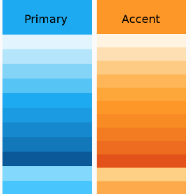
Each shade is related to a particular purpose or set of purposes within the app. So for example, the shade that works best for text isn't necessarily the same shade you would use for flat areas of color. Material Design provides a number of standard themes with shades that are carefully chosen for each purpose within the UI. The CSS files are designed so that the names are consistent between themes (so the same "purpose" will always have the same class name across CSS files). This makes it easy to switch themes simply by changing a few CSS definitions. Material Design also defines the relationship between the different shades, so you can calculate your own color values or, more straightforwardly, use an online palette design tool.
See the Material Design Style page for more information about color concepts.
Defining a custom theme
When you want more customization than a pre-built theme offers, you can create your own theme file. You only need to include the packages you actually use in your application.
/*
 *  Include only packages that you are using (and core by default)
 */
@use '@angular/material' as mat;
@import '~@angular/material/theming';
@import '~@alfresco/adf-core/theming';

@include mat.core();

$primary: mat.define-palette($alfresco-accent-orange);
$accent:  mat.define-palette($alfresco-accent-purple);
$warn:    mat.define-palette($alfresco-warn);
$theme:   mat.define-light-theme((
    color: (
        primary: $primary,
        accent: $accent,
        warn: $warn,
    ),
    typography: $alfresco-typography
));

@include angular-material-theme($theme);
@include alfresco-material-theme($theme);
Multiple themes
You can create multiple themes for your application:
Example of defining multiple themes
@import '~@angular/material/theming';
@import '~@alfresco/adf-core/theming';

@include mat-core($alfresco-typography);

$primary: mat.define-palette($alfresco-accent-orange);
$accent:  mat.define-palette($alfresco-accent-purple);
$warn:    mat.define-palette($alfresco-warn);
$theme:   mat.define-light-theme((
    color: (
        primary: $primary,
        accent: $accent,
        warn: $warn,
    ),
    typography: $alfresco-typography
));

$dark-theme:   mat.define-dark-theme((
    color: (
        primary: $primary,
        accent: $accent,
        warn: $warn,
    ),
    typography: $alfresco-typography
));

@include alfresco-material-theme($theme);
...like above

.adf-dark-theme {
    @include alfresco-material-theme($dark-theme);
    ...like above
}
Any component with the add-dark-theme class will use the dark theme, while other components will fall back to the default.
Default reusable class
.accent-color                // Accent color
.warn-color                  // Warn color
.primary-contrast-text-color // Default contrast color for primary color
.accent-contrast-text-color  // Default contrast color for accent color
.background-color            // Dialog background color
.primary-background-color    // Primary background color
.accent-background-color     // Default background color for accent
Styles
Avoid adding css variables with names related to components:
--my-component-nr-xxx-background-color: mat.get-color-from-palette($primary, 50),  // bad
--theme-primary-color-50: mat.get-color-from-palette($primary, 50)  // good
Avoid adding css variables with custom values, values should come from the theme:
--new-variable: yellow  // bad
--new-variable: mat.get-color-from-palette($primary, 50), // good
When styling components try to use theme related variables (colors, typography):
.my-class {
  color:darkgrey;  // bad
  color:var(--theme-primary-color);  // good
  font-size:23px; // bad
  font-size:var(--theme-typography-body-1-font-size); // good
  background:yellow; // bad
  background:var(--my-component-nr-200-background-color);  // bad
  background:var(--theme-primary-color-50);  // good
}
When using library like Angular Material try to follow patterns from this library. It helps to style components built with this library (just apply theme instead of custom styling). For example when creating input:
// bad
<div class="my-custom-input">
  <div class="my-custom-label"></div>
  <mat-form-field>
    <input type="text">
  </mat-form-field>
  <div class="my-custom-error"></div>
</div>

// good
<mat-form-field>
  <mat-label></mat-label>
  <input type="text">
  <mat-hint></mat-hint>
  <mat-error></mat-error>
</mat-form-field>