 1fa81962a0
* fix after rebase

* new release strategy for ng next

Signed-off-by: eromano <eugenioromano16@gmail.com>

* peer dep

Signed-off-by: eromano <eugenioromano16@gmail.com>

* Angular 14

fix unit test and storybook

Signed-off-by: eromano <eugenioromano16@gmail.com>

fix after rebase

Signed-off-by: eromano <eugenioromano16@gmail.com>

update pkg.json

Signed-off-by: eromano <eugenioromano16@gmail.com>

missing dep

Signed-off-by: eromano <eugenioromano16@gmail.com>

Fix mistake and missing code

Dream....build only affected libs

Add utility run commands

* Use nx command to run affected tests

* Fix nx test core

fix content tests

Run unit with watch false

core test fixes

reduce test warnings

Fix process cloud unit

Fix adf unit test

Fix lint process cloud

Disable lint next line

Use right core path

Fix insights unit

fix linting insights

Fix process-services unit

fix the extensions test report

fix test warnings

Fix content unit

Fix bunch of content unit

* Produce an adf alpha of 14

* hopefully fixing the content

* Push back the npm publish

* Remove flaky unit

* Fix linting

* Make the branch as root

* Get rid of angualar13

* Remove the travis depth

* Fixing version for npm

* Enabling cache for unit and build

* Fix scss for core and paths

Copy i18 and asset by using ng-packager

Export the theming alias and fix path

Use ng-package to copy assets process-services-cloud

Use ng-package to copy assets process-services

Use ng-package to copy assets content-services

Use ng-package to copy assets insights

* feat: fix api secondary entry point

* fix storybook rebase

* Move dist under dist/libs from lib/dist

* Fix the webstyle

* Use only necessary nrwl deps and improve lint

* Fix unit for libs

* Convert lint.sh to targets - improve performance

* Use latest of angular

* Align alfresco-js-api

Signed-off-by: eromano <eugenioromano16@gmail.com>
Co-authored-by: eromano <eugenioromano16@gmail.com>
Co-authored-by: Mikolaj Serwicki <mikolaj.serwicki@hyland.com>
Co-authored-by: Tomasz <tomasz.gnyp@hyland.com>
12 KiB
Title, Added, Status, Last reviewed
| Title | Added | Status | Last reviewed |
|---|---|---|---|
| Data Column Component | v2.0.0 | Active | 2019-04-12 |
Data Column Component
Defines column properties for DataTable, Tasklist, Document List and other components.
Contents
Basic Usage
<adf-datatable [data]="data">
    <data-columns>
        <data-column key="icon" type="image" [sortable]="false"></data-column>
        <data-column key="id" title="Id"></data-column>
        <data-column key="createdOn" title="Created"></data-column>
        <data-column key="name" title="Name" class="full-width name-column"></data-column>
        <data-column key="createdBy.name" title="Created By"></data-column>
    </data-columns>
</adf-datatable>
Class members
Properties
| Name | Type | Default value | Description |
|---|---|---|---|
| copyContent | boolean |
Enables/disables a Clipboard directive to allow copying of cell contents. | |
| cssClass | string |
Additional CSS class to be applied to column (header and cells). | |
| customData | any |
You can specify any custom data which can be used by any specific feature | |
| draggable | boolean |
false | Toggles drag and drop for header column. |
| editable | boolean |
false | Toggles the editing support of the column data. |
| focus | boolean |
true | Enable or disable cell focus |
| format | string |
Value format (if supported by the parent component), for example format of the date. | |
| formatTooltip | Function |
Custom tooltip formatter function. | |
| id | string |
"" | Column identifier. |
| isHidden | boolean |
false | Hides columns |
| key | string |
Data source key. Can be either a column/property key like title or a property path like createdBy.name. |
|
| sortable | boolean |
true | Toggles ability to sort by this column, for example by clicking the column header. |
| sortingKey | string |
When using server side sorting the column used by the api call where the sorting will be performed | |
| srTitle | string |
Title to be used for screen readers. | |
| title | string |
"" | Display title of the column, typically used for column headers. You can use the i18n resource key to get it translated automatically. |
| type | string |
"text" | Value type for the column. Possible settings are 'text', 'image', 'date', 'fileSize', 'location', and 'json'. |
Details
Conditional visibility
You can use ngIf directives to provide conditional visibility support for the columns:
<data-column
    *nfIg="showNameColumn"
    key="name"
    title="MY.RESOURCE.KEY">
</data-column>
Automatic column header translation
You can use i18n resource keys with the
DataColumn title property.
The component will automatically check the appropriate i18n resources and fetch the corresponding value.
<data-column
    key="name"
    title="MY.RESOURCE.KEY">
</data-column>
This feature is optional. Regular text (either plain or converted via the translate pipe) will still work as normal.
Custom tooltips
You can create custom tooltips for the table cells by providing a formatTooltip property with a tooltip formatter function when declaring a data column.
<data-column
    title="Name"
    key="name"
    [formatTooltip]="getNodeNameTooltip"
    class="full-width ellipsis-cell">
</data-column>
And the code in this case will be similar to the following:
import { DataColumn, DataRow } from '@alfresco/adf-core';

@Component({...})
export class MyComponent {
    ...

    getNodeNameTooltip(row: DataRow, col: DataColumn): string {
        if (row) {
            return row.getValue('name');
        }
        return null;
    }
}
To disable the tooltip your function can return null or an empty string.
Column Template
You can provide custom column/cell header and templates that may contain other Angular components or HTML elements:
Every cell in the DataTable component is bound to the dynamic data context containing the following properties:
| Name | Type | Description |
|---|---|---|
| data | DataTableAdapter |
Data adapter instance. |
| row | DataRow |
Current data row instance. |
| col | DataColumn |
Current data column instance. |
You can use all three properties to gain full access to underlying data from within your custom templates.
In order to wire HTML templates with the data context you will need to define a variable that is bound to $implicit as shown below:
<ng-template let-context="$implicit">
    <!-- template body -->
</ng-template>
The name format is let-VARIABLE_NAME="$implicit" where VARIABLE_NAME is the name of the variable you want to bind the template data context to.
You can also get a cell value from the underlying DataTableAdapter:
context.data.getValue(entry.row, entry.col);
You can retrieve all property values for the underlying node, including nested properties (via property paths):
context.row.getValue('name')
context.row.getValue('createdByUser.displayName')
You may want to use the row API to get access to the raw values.
<data-column title="Name" key="name" sortable="true" class="full-width ellipsis-cell">
    <ng-template let-context="$implicit">
        <span>Hi! {{context.row.getValue('createdByUser.displayName')}}</span>
        <span>Hi! {{context.row.getValue('name')}}</span>
    </ng-template>
</data-column>
Use the data API to get values with post-processing (eg, datetime or icon conversion).
In the Example below we will prepend Hi! to each file and folder name in the list:
<data-column title="Name" key="name" sortable="true" class="full-width ellipsis-cell">
    <ng-template let-entry="$implicit">
        <span>Hi! {{entry.data.getValue(entry.row, entry.col)}}</span>
    </ng-template>
</data-column>
In the example below we will show capitalised custom name for a column:
<data-column title="Name" key="name" sortable="true" class="full-width ellipsis-cell">
    <adf-data-column-header>
        <ng-template let-entry="$implicit">
            <span>NAME</span>
        </ng-template>
    </adf-data-column-header>
</data-column>
In the Example below we will integrate the adf-tag-node-list component within the document list.
<data-column
    title="{{'DOCUMENT_LIST.COLUMNS.TAG' | translate}}"
    key="id"
    sortable="true"
    class="full-width ellipsis-cell">
    <ng-template let-entry="$implicit">
        <adf-tag-node-list  [nodeId]="entry.data.getValue(entry.row, entry.col)"></adf-tag-node-list>
    </ng-template>
</data-column>

Styling Techniques
You can add a custom CSS class to a column using its class property. This is useful for
many purposes - some examples are given below.
Custom icons for selected rows
Custom styling can be used to change the look and feel of the icon for the selected rows.
Let's start by assigning an "image-table-cell" class to the thumbnail column:
<adf-document-list ...>
    <data-columns>

        <data-column
            key="$thumbnail"
            type="image"
            [sortable]="false"
            class="adf-image-table-cell">
        </data-column>

        ...
    </data-columns>
</adf-document-list>
Now your application can define styles to change the content of the column based on conditions such as the selection state:
adf-document-list ::ng-deep adf-datatable > table > tbody > tr.is-selected > td.adf-datatable-cell.adf-datatable-cell--image.adf-image-table-cell > div > div > mat-icon > svg {
    fill: #00bcd4;
}
Once your application starts you should see the following icon for each selected row:
Hiding columns on small screens
You can hide columns on small screens using custom CSS rules:
@media all and (max-width: 768px) {

    alfresco-document-list ::ng-deep th.desktop-only .cell-value {
        display: none;
    }

    alfresco-document-list ::ng-deep td.desktop-only .cell-value {
        display: none;
    }
}
Now you can declare columns and assign the desktop-only class where needed:
<adf-document-list ...>
    <data-columns>

        <!-- always visible columns -->

        <data-column key="$thumbnail" type="image"></data-column>
        <data-column
                title="Name"
                key="name"
                class="full-width ellipsis-cell">
        </data-column>

        <!-- desktop-only columns -->

        <data-column
                title="Created by"
                key="createdByUser.displayName"
                class="desktop-only">
        </data-column>
        <data-column
                title="Created on"
                key="createdAt"
                type="date"
                format="medium"
                class="desktop-only">
        </data-column>
    </data-columns>
</adf-document-list>
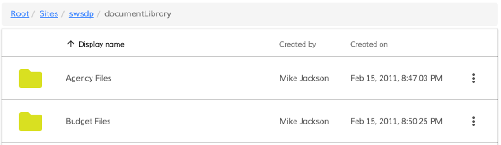
Desktop View
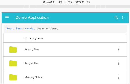
Mobile View
Using the copyContent option
When the copyContent property is true, a
Clipboard directive
is added to each cell in the column. This lets the user copy the cell content
to the clipboard with a mouse click.
See the Clipboard Directive page for full details of the directive.
Example of using copyContent from a JSON config file:
[
 {"type": "text", "key": "id", "title": "Id", "copyContent": "true"},
 {"type": "text", "key": "name", "title": "name"},
]
HTML <data-column> element example:
<adf-tasklist ...>
    <data-columns>
        <data-column [copyContent]="true" key="id" title="Id"></data-column>
        ...
    </data-columns>
</adf-tasklist>
Example of column customData
If you would like to pass any custom data related to your specific feature, you can use customData
HTML <data-column> element example:
<data-column [customData]="MyCustomData" key="id" title="Id"></data-column>
You can use generic type for DataColumn in order to get intellisense working e.g.
const dataColumn: DataColumn<{ shouldPerformActionIfDisplayed: boolean }> = {
    ...
    customData: { shouldPerformActionIfDisplayed: true }
}

// We should get proper types
consol.log(dataColumn.customData.shouldPerformActionIfDisplayed);

// Now we can use this data in our feature e.g.
const shouldPerformAction = this.columns
    .filter(column => column.isHidden)
    .some(column => column.customData?.shouldPerformActionIfDisplayed === true);

if (shouldPerformAction) { /* action */}