 1fa81962a0
* fix after rebase

* new release strategy for ng next

Signed-off-by: eromano <eugenioromano16@gmail.com>

* peer dep

Signed-off-by: eromano <eugenioromano16@gmail.com>

* Angular 14

fix unit test and storybook

Signed-off-by: eromano <eugenioromano16@gmail.com>

fix after rebase

Signed-off-by: eromano <eugenioromano16@gmail.com>

update pkg.json

Signed-off-by: eromano <eugenioromano16@gmail.com>

missing dep

Signed-off-by: eromano <eugenioromano16@gmail.com>

Fix mistake and missing code

Dream....build only affected libs

Add utility run commands

* Use nx command to run affected tests

* Fix nx test core

fix content tests

Run unit with watch false

core test fixes

reduce test warnings

Fix process cloud unit

Fix adf unit test

Fix lint process cloud

Disable lint next line

Use right core path

Fix insights unit

fix linting insights

Fix process-services unit

fix the extensions test report

fix test warnings

Fix content unit

Fix bunch of content unit

* Produce an adf alpha of 14

* hopefully fixing the content

* Push back the npm publish

* Remove flaky unit

* Fix linting

* Make the branch as root

* Get rid of angualar13

* Remove the travis depth

* Fixing version for npm

* Enabling cache for unit and build

* Fix scss for core and paths

Copy i18 and asset by using ng-packager

Export the theming alias and fix path

Use ng-package to copy assets process-services-cloud

Use ng-package to copy assets process-services

Use ng-package to copy assets content-services

Use ng-package to copy assets insights

* feat: fix api secondary entry point

* fix storybook rebase

* Move dist under dist/libs from lib/dist

* Fix the webstyle

* Use only necessary nrwl deps and improve lint

* Fix unit for libs

* Convert lint.sh to targets - improve performance

* Use latest of angular

* Align alfresco-js-api

Signed-off-by: eromano <eugenioromano16@gmail.com>
Co-authored-by: eromano <eugenioromano16@gmail.com>
Co-authored-by: Mikolaj Serwicki <mikolaj.serwicki@hyland.com>
Co-authored-by: Tomasz <tomasz.gnyp@hyland.com>
27 KiB
Title, Added, Status, Last reviewed
| Title | Added | Status | Last reviewed |
|---|---|---|---|
| DataTable component | v2.0.0 | Active | 2019-04-12 |
DataTable component
Displays data as a table with customizable columns and presentation.
See it live: DataTable Quickstart
Contents
Basic usage
app.component.html
<adf-datatable
    [data]="data">
</adf-datatable>
app.component.ts
import { ObjectDataTableAdapter } from '@alfresco/adf-core';
@Component({...})
export class DataTableDemo {
data: ObjectDataTableAdapter;
constructor() {
this.data = new ObjectDataTableAdapter(
// data
[
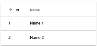
{id: 1, name: 'Name 1'},
{id: 2, name: 'Name 2'}
],
// schema
[
{
type: 'text',
key: 'id',
title: 'Id',
sortable: true
},
{
type: 'text',
key: 'name',
title: 'Name',
cssClass: 'full-width',
sortable: true
}
]
);
}
}
Setting the rows and column schema
You can set rows and columns in the ObjectDataTableAdapter as shown below:
import { ObjectDataTableAdapter }  from '@alfresco/adf-core';

@Component({...})
export class DataTableDemo {
    data: ObjectDataTableAdapter;

    constructor() {
        this.data = new ObjectDataTableAdapter(
            // data
            [
                {id: 1, name: 'Name 1'},
                {id: 2, name: 'Name 2'}
            ],
            // columns
            [
                {
                    type: 'text',
                    key: 'id',
                    title: 'Id',
                    sortable: true
                },
                {
                    type: 'text',
                    key: 'name',
                    title: 'Name',
                    cssClass: 'full-width',
                    sortable: true
                }
            ]
        );
    }
}
<adf-datatable
    [data]="data">
</adf-datatable>
You can also set rows and use an HTML-based schema declaration as shown below:
import { ObjectDataTableAdapter }  from '@alfresco/adf-core';

@Component({...})
export class DataTableDemo {
    data: ObjectDataTableAdapter;

    constructor() {
        this.data = new ObjectDataTableAdapter(
            // data
            [
                {id: 1, name: 'Name 1'},
                {id: 2, name: 'Name 2'}
            ],
            []
        );
    }
}
<adf-datatable [data]="data">
    <data-columns>
        <data-column key="icon" type="image" [sortable]="false"></data-column>
        <data-column key="id" title="Id"></data-column>
        <data-column key="createdOn" title="Created"></data-column>
        <data-column key="name" title="Name" class="full-width name-column"></data-column>
        <data-column key="createdBy.name" title="Created By"></data-column>
    </data-columns>
</adf-datatable>
You can also set rows in the ObjectDataTableAdapter and set columns as an input as shown below :
import { ObjectDataTableAdapter }  from '@alfresco/adf-core';

@Component({...})
export class DataTableDemo {
    data: ObjectDataTableAdapter;
    schema: any;

    constructor() {
        this.data = new ObjectDataTableAdapter(
            // data
            [
                {id: 1, name: 'Name 1'},
                {id: 2, name: 'Name 2'}
            ],
            []
        );
        // columns
        this.schema =
            [
                {
                    type: 'text',
                    key: 'id',
                    title: 'Id',
                    sortable: true
                },
                {
                    type: 'text',
                    key: 'name',
                    title: 'Name',
                    sortable: true
                }
            ];
    }
}
<adf-datatable
    [data]="data"
    [columns]="schema">
</adf-datatable>
You can also set rows and columns through inputs as shown below :
import { ObjectDataTableAdapter }  from '@alfresco/adf-core';

@Component({...})
export class DataTableDemo {
    rows: any;
    schema: any;

    constructor() {
        // data
        this.rows =
            [
                {id: 1, name: 'Name 1'},
                {id: 2, name: 'Name 2'}
            ];
        // columns
        this.schema =
            [
                {
                    type: 'text',
                    key: 'id',
                    title: 'Id',
                    sortable: true
                },
                {
                    type: 'text',
                    key: 'name',
                    title: 'Name',
                    sortable: true
                }
            ];
    }
}
<adf-datatable
    [rows]="rows"
    [columns]="schema">
</adf-datatable>
Transclusions
You can add Data column component instances to define columns for thetable as described in the usage examples and the Customizing columns section.
<adf-datatable ...>
    <data-column>
        <!--Add your custom empty template here-->
        <ng-template>
            <div></div>
            <span> My custom value </span>
        </ng-template>
    </data-column>
</adf-datatable>
You can also supply a <adf-no-content-template> or an
Empty list component sub-component to show when the table is empty:
<adf-datatable ...>
    <adf-no-content-template>
        <!--Add your custom empty template here-->
        <ng-template>
            <h1>Sorry, no content</h1>
        </ng-template>
    </adf-no-content-template>
</adf-datatable>
<adf-datatable ...>
    <adf-empty-list>
        <adf-empty-list-header>"'My custom Header'"</adf-empty-list-header>
        <adf-empty-list-body>"'My custom body'"</adf-empty-list-body>
        <adf-empty-list-footer>"'My custom footer'"</adf-empty-list-footer>
        <ng-content>"'HTML Layout'"</ng-content>
    </adf-empty-list>
</adf-datatable>
Another useful transclusion is the <adf-loading-content-template>, which is shown
while the data for the table is loading:
<adf-datatable ...>
    <adf-loading-content-template>
        <ng-template>
            <!--Add your custom loading template here-->
            <mat-progress-spinner
                class="adf-document-list-loading-margin"
                [color]="'primary'"
                [mode]="'indeterminate'">
            </mat-progress-spinner>
        </ng-template>
    </adf-loading-content-template>
</adf-datatable>
    isLoading(): boolean {
        //your custom logic to identify if you are in a loading state
    }
You can also show main menu for datatable using <adf-main-menu-datatable-template>
<adf-datatable ...>
   <adf-main-menu-datatable-template>
        <ng-template let-mainMenuTrigger>
            <!--Add your custom main menu template here-->
            <adf-datatable-column-selector
                [columns]="data.getColumns()"
                [mainMenuTrigger]="mainMenuTrigger"
                (submitColumnsVisibility)="onColumnsVisibilityChange($event)">
            </adf-datatable-column-selector>
        </ng-template>
    </adf-main-menu-datatable-template>
</adf-datatable>
Provided template receives let-mainMenuTrigger, so you can programaticaly work with the menu (please see MatMenuTrigger).
For convenience, you can use <adf-datatable-column-selector> which will allow you to change column visibility.
###Styling transcluded content
When adding your custom templates you can style them as you like. However, for an out of the box experience, if you want to apply datatable styles to your column you will need to follow this structure:
<adf-datatable ...>
    <data-column>
        <!--Add your custom empty template here-->
        <ng-template>
            <div class="adf-datatable-content-cell">
                <span class="adf-datatable-cell-value"> My custom value </span>
            </div>
        </ng-template>
    </data-column>
</adf-datatable>
Notice above those two classes. Apply adf-datatable-content-cell for the container of the value that you are going to place in that column and adf-datatable-cell-value for the value itself.
If you follow these structure you will be able to apply classes like .adf-ellipsis-cell and much more.
Note that you can use both the <adf-no-content-template> and the <adf-loading-content-template>
together in the same datatable.
Learm more about styling your datatable: Customizing the component's styles
Class members
Properties
| Name | Type | Default value | Description |
|---|---|---|---|
| actions | boolean |
false | Toggles the data actions column. |
| actionsPosition | string |
"right" | Position of the actions dropdown menu. Can be "left" or "right". |
| actionsVisibleOnHover | boolean |
false | Toggles whether the actions dropdown should only be visible if the row is hovered over or the dropdown menu is open. |
| allowFiltering | boolean |
false | Flag that indicate if the datatable allow the use facet widget search for filtering. |
| columns | any[] |
[] | The columns that the datatable will show. |
| contextMenu | boolean |
false | Toggles custom context menu for the component. |
| data | DataTableAdapter |
Data source for the table | |
| display | string |
DisplayMode.List | Selects the display mode of the table. Can be "list" or "gallery". |
| fallbackThumbnail | string |
Fallback image for rows where the thumbnail is missing. | |
| loading | boolean |
false | Flag that indicates if the datatable is in loading state and needs to show the loading template (see the docs to learn how to configure a loading template). |
| mainTableAction | boolean |
true | Toggles main data table action column. |
| multiselect | boolean |
false | Toggles multiple row selection, which renders checkboxes at the beginning of each row. |
| noPermission | boolean |
false | Flag that indicates if the datatable should show the "no permission" template. |
| resolverFn | Function |
null | Custom resolver function which is used to parse dynamic column objects see the docs to learn how to configure a resolverFn. |
| rowMenuCacheEnabled | boolean |
true | Should the items for the row actions menu be cached for reuse after they are loaded the first time? |
| rowStyle | Function |
The inline style to apply to every row. See NgStyle docs for more details and usage examples. | |
| rowStyleClass | string |
"" | The CSS class to apply to every row. |
| rows | any[] |
[] | The rows that the datatable will show. |
| selectionMode | string |
"single" | Row selection mode. Can be none, single or multiple. For multiple mode, you can use Cmd (macOS) or Ctrl (Win) modifier key to toggle selection for multiple rows. |
| showHeader | ShowHeaderMode |
Toggles the header. | |
| showMainDatatableActions | boolean |
false | Toggles the main datatable action. |
| sorting | any[] |
[] | Define the sort order of the datatable. Possible values are : [created, desc], [created, asc], [due, desc], [due, asc] |
| stickyHeader | boolean |
false | Toggles the sticky header mode. |
Events
| Name | Type | Description |
|---|---|---|
| columnOrderChanged | EventEmitter<DataColumn<>[]> |
Emitted after dragging and dropping column header. |
| executeRowAction | EventEmitter<DataRowActionEvent> |
Emitted when the user executes a row action. |
| rowClick | EventEmitter<DataRowEvent> |
Emitted when the user clicks a row. |
| rowDblClick | EventEmitter<DataRowEvent> |
Emitted when the user double-clicks a row. |
| showRowActionsMenu | EventEmitter<DataCellEvent> |
Emitted before the actions menu is displayed for a row. |
| showRowContextMenu | EventEmitter<DataCellEvent> |
Emitted before the context menu is displayed for a row. |
Details
Supplying data for the table
The column layout and row data are supplied to the table using an object that implements the
DataTableAdapter interface. This interface hides the internal details of the class that provides
the data, which gives a lot of flexibility in how the data can be stored and accessed. The DataTable
library includes a standard adapter class called ObjectDataTableAdapter that is useful in many
common cases. See the DataTableAdapter for full details about the interface and the ObjectDataTableAdapter class.
Customizing columns
You can define custom HTML templates for columns and also add tooltips, automatic column title translation and other features. See the Data Column component page for more information.
DataTable DOM Events
Below are the DOM events emitted by the DataTable component. These events bubble up the component tree and can be handled by any parent component.
| Name | Description |
|---|---|
| row-click | Raised when user clicks a row |
| row-dblclick | Raised when user double-clicks a row |
| row-select | Raised after user selects a row |
| row-unselect | Raised after user unselects a row |
| row-keyup | Raised on the 'keyup' event for the focused row. |
| sorting-changed | Raised after user clicks the sortable column header. |
| header-dragover | Raised when dragging content over the header. |
| header-drop | Raised when data is dropped on the column header. |
| cell-dragover | Raised when dragging data over the cell. |
| cell-drop | Raised when data is dropped on the column cell. |
Drop Events
All custom DOM events related to drop handling expose the following interface:
export interface DataTableDropEvent {
    detail: {
        target: 'cell' | 'header';
        event: Event;
        column: DataColumn;
        row?: DataRow
    };

    preventDefault(): void;
}
Note that event is the original drop event,
and row is not available for Header events.
According to the HTML5 Drag and Drop API,
you need to handle both dragover and drop events to handle the drop correctly.
Given that DataTable raises bubbling DOM events, you can handle drop behavior from the parent elements as well:
<div
    (header-dragover)="onDragOver($event)"
    (header-drop)="onDrop($event)"
    (cell-dragover)="onDragOver($event)"
    (cell-drop)="onDrop($event)">

    <adf-datatable [data]="data">
    </adf-datatable>
</div>
Where the implementation of the handlers can look like following:
onDragOver(event: CustomEvent) {
    // always needed for custom drop handlers (!)
    event.preventDefault();
}

onDrop(event: DataTableDropEvent) {
    event.preventDefault();

    const { column, row, target } = event.detail;
    // do something with the details
}
Example
<root-component (row-click)="onRowClick($event)">
    <child-component>
        <adf-datatable></adf-datatable>
    </child-component>
</root-component>
onRowClick(event) {
    console.log(event);
}

Card view
Set the display property to "gallery" to enable Card View mode:
<adf-datatable
    [data]="data"
    [display]="'gallery'">
</adf-datatable

Using events
row-keyup DOM event
Emitted on the 'keyup' event for the focused row.
This is an instance of CustomEvent with the details property containing the following object:
row: DataRow,
keyboardEvent: KeyboardEvent,
sender: any
rowClick event
Emitted when the user clicks a row.
Event properties:
sender: any     // DataTable instance
value: DataRow, // row clicked
event: Event    // original HTML DOM event
Handler example:
onRowClicked(event: DataRowEvent) {
    console.log(event.value);
}
This event is cancellable. You can use event.preventDefault() to prevent the default behavior.
rowDblClick event
Emitted when the user double-clicks a row.
Event properties:
sender: any     // DataTable instance
value: DataRow, // row clicked
event: Event    // original HTML DOM event
Handler example:
onRowDblClicked(event: DataRowEvent) {
    console.log(event.value);
}
This event is cancellable. You can use event.preventDefault() to prevent the default behavior.
showRowContextMenu event
Emitted before the context menu is displayed for a row.
Note that the DataTable itself does not populate the context menu with items. You can provide all necessary content via the handler.
Event properties:
value: {
    row: DataRow,
    col: DataColumn,
    actions: []
}
Handler example:
onShowRowContextMenu(event: DataCellEvent) {
    event.value.actions = [
        { ... },
        { ... }
    ]
}
This event is cancellable. You can use event.preventDefault() to prevent the default behavior.
The DataTable will automatically render the supplied menu items.
See the ContextMenu documentation for more details on the format and behavior of context actions.
showRowActionsMenu event
Emitted before the actions menu is displayed for a row.
Requires the actions property to be set to true.
Event properties:
value: {
    row: DataRow,
    action: any
}
Note that the DataTable itself does not populate the action menu with items. You can provide all necessary content via the handler.
This event is cancellable. You can use event.preventDefault() to prevent the default behavior.
executeRowAction event
Emitted when the user executes a row action.
This usually accompanies a showRowActionsMenu event.
The DataTable itself does not execute actions but provides support for external
integration. If actions are provided using the showRowActionsMenu event
then executeRowAction will be automatically executed when the user clicks a
corresponding menu item.
<adf-datatable
    [data]="data"
    [multiselect]="multiselect"
    [actions]="true"
    (showRowActionsMenu)="onShowRowActionsMenu($event)"
    (executeRowAction)="onExecuteRowAction($event)">
</adf-datatable>
import { DataCellEvent, DataRowActionEvent } from '@alfresco/adf-core';

onShowRowActionsMenu(event: DataCellEvent) {
    let myAction = {
        title: 'Hello'
        // your custom metadata needed for onExecuteRowAction
    };
    event.value.actions = [
        myAction
    ];
}

onExecuteRowAction(event: DataRowActionEvent) {
    let args = event.value;
    console.log(args.row);
    console.log(args.action);
    window.alert(`My custom action: ${args.action.title}`);
}


You can use any payloads for row actions. The only requirement for the objects is that they
must have a title property.
When an action is selected in the dropdown menu, the DataTable invokes the executeRowAction event.
Use this to handle the response, inspect the action payload (and all custom properties defined
earlier), and perform the corresponding actions.
Customizing the component's styles
The datatable component is ready to be used out of the box but you can customize the styling to suit your needs as described in the following sections.
Truncated text
By default, the content of the cells is wrapped so you can see all the data inside, as shown below:

However, you can also truncate the text within these cells using the adf-ellipsis-cell class in the desired column:
{
    type: 'text',
    key: 'createdOn',
    title: 'Created On',
    sortable: true,
    cssClass: 'adf-ellipsis-cell'
}

Expanded cells
This component uses a flexible layout. By default, all cells are assumed to have the same semantic importance, so all of them have the same width. We provide a predefined set of CSS classes that you can use to vary the relative widths of the columns.
The classes have names of the form adf-expand-cell-X, going from adf-expand-cell-1 to adf-expand-cell-5. The higher the number in the
class the wider the column will be. Use these classes to vary the column
widths according to your needs:

No-growing cells
As mentioned before, all cells initially have the same width. You can prevent cells from
growing by using the adf-no-grow-cell class.
{
    type: 'date',
    key: 'created',
    title: 'Created On',
    cssClass: 'adf-ellipsis-cell adf-no-grow-cell'
}
Note that this class is compatible with adf-ellipsis-cell and for that reason it has a min-width of 100px. You can override this property in your custom class to better suit your needs.

Combining classes
You can combine the CSS classes described above to customize the table as needed:
{
    type: 'text',
    key: 'name',
    title: 'Name',
    cssClass: 'adf-ellipsis-cell adf-expand-cell-3'
}
Sticky header
If you have a long table with many rows, you might want to fix the header in place so it is always visible. You can do this using the following steps.
First, set the stickyHeader property of your datatable to true:
<adf-datatable
    [data]="data"
    [stickyHeader]="true">
</adf-datatable>
Then, set the height of your datatable in its parent's container so that the datatable adapts to it (i.e. height: 300px; in the example below). You must also set the parent's
overflow-y attribute to auto. This will allow the list to scroll when
the total height of all rows exceeds the fixed height of the parent element.
<div style="height: 300px; overflow-y: auto;">
    <adf-datatable
        [data]="data"
        [stickyHeader]="'true'">
    </adf-datatable>
</div>
Once set up, the sticky header behaves as shown in the image below:

Resolver Function
If you have a table with complex object, you might want to parse it before to display. you can do this using following steps.
what is resolver
Resolver is a pure function which gets executed on each row and columns.
purpose
It helps to parse the complex object in the data table.
example
Assume we want to merge two properties and show them in a text format
                {
                    name: 'I am using custom resolver',
                    users: [
                        {
                            firstName: 'Captain',
                            lastName: 'America'
                        },
                        {
                            firstName: 'John',
                            lastName: 'Wick'
                        }
                    ],
                    status: [
                        'I am here to save the world.. By world means AMERICA',
                        'That nobody is John Wick…'
                    ]
                }
here is the sample resolver which merge the users property and status and it will show in one column
    resolver(row: DataRow, col: DataColumn): any {
        const value = row.getValue(col.key);

        // Desired parsing logic
        if (col.key === 'status') {
            const users = row.getValue('users');
            return (value || []).map((status, index) => `name - ${users[index].firstName} ${users[index].lastName} status: ${status}` ).toString();
        }

        return value;
    }
    <adf-datatable
        [data]="data"
        [resolverFn]="resolver">
        <data-columns>
            <data-column type="text" key="name" title="Name"></data-column>
            <data-column type="text" key="users" title="Users"></data-column>
            <data-column type="text" key="status" title="Status"></data-column>
        </data-columns>
    </adf-datatable>

Tooltip
You can define the tooltip format for cells of type date using a configuration in app.config.json:
 "dateValues": {
    "defaultTooltipDateFormat": "medium"
 }